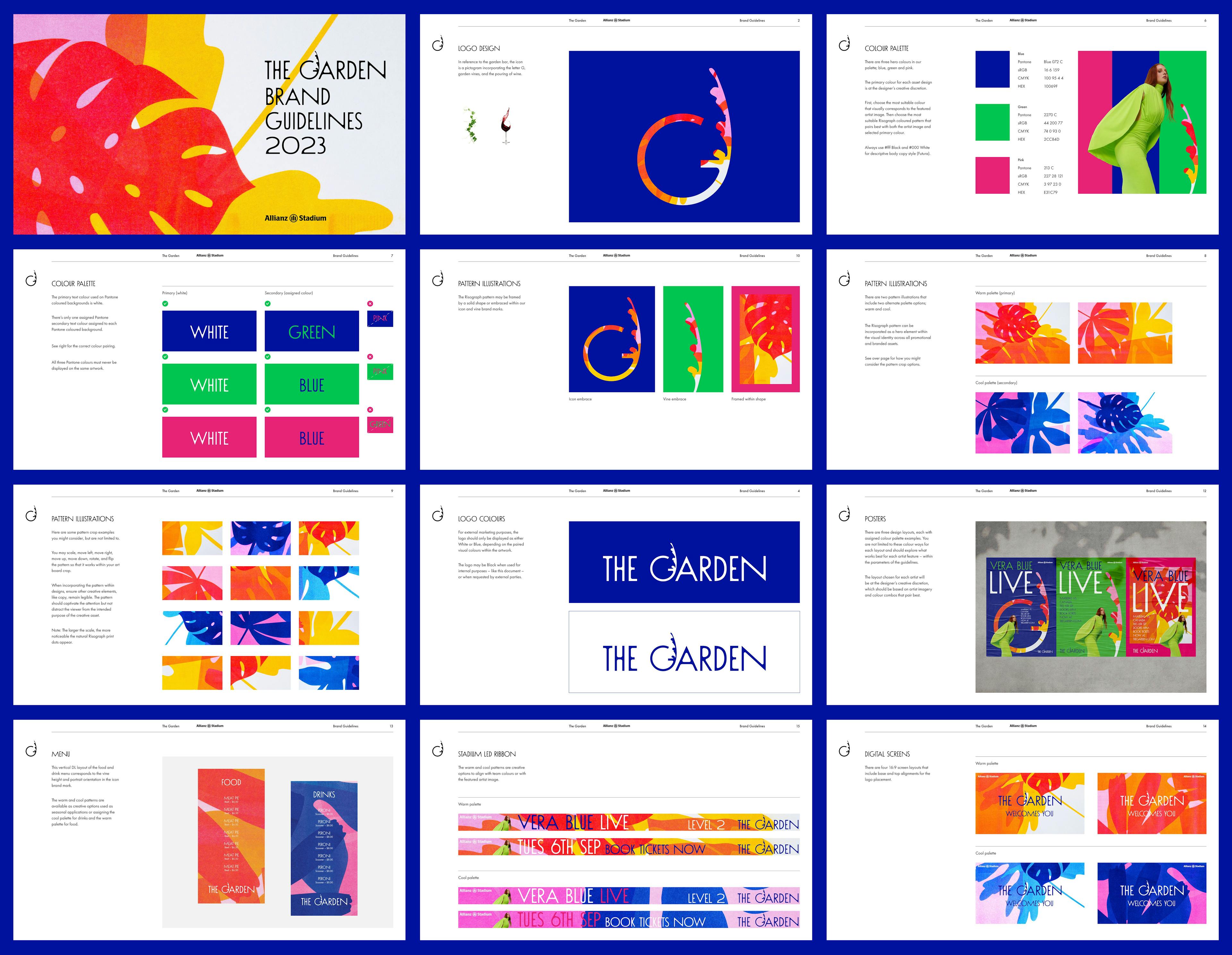
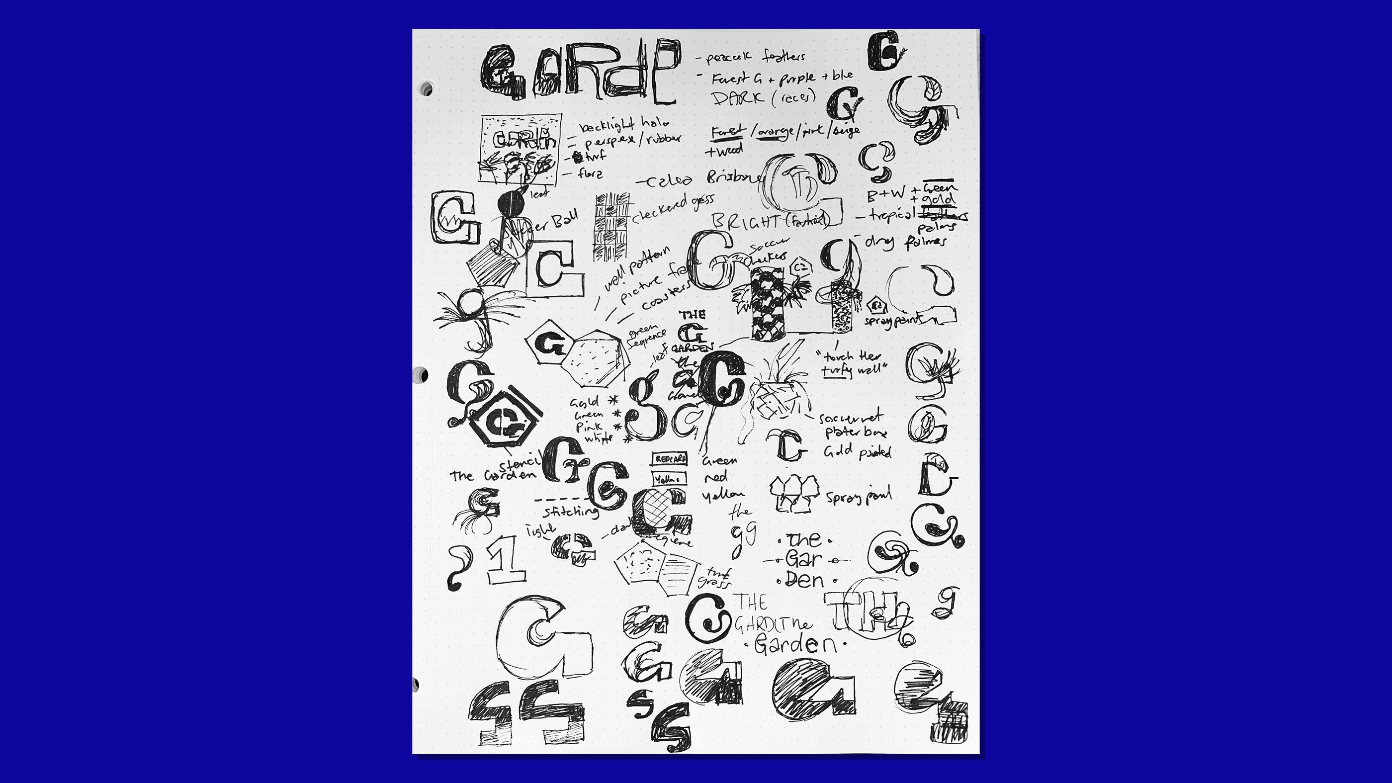
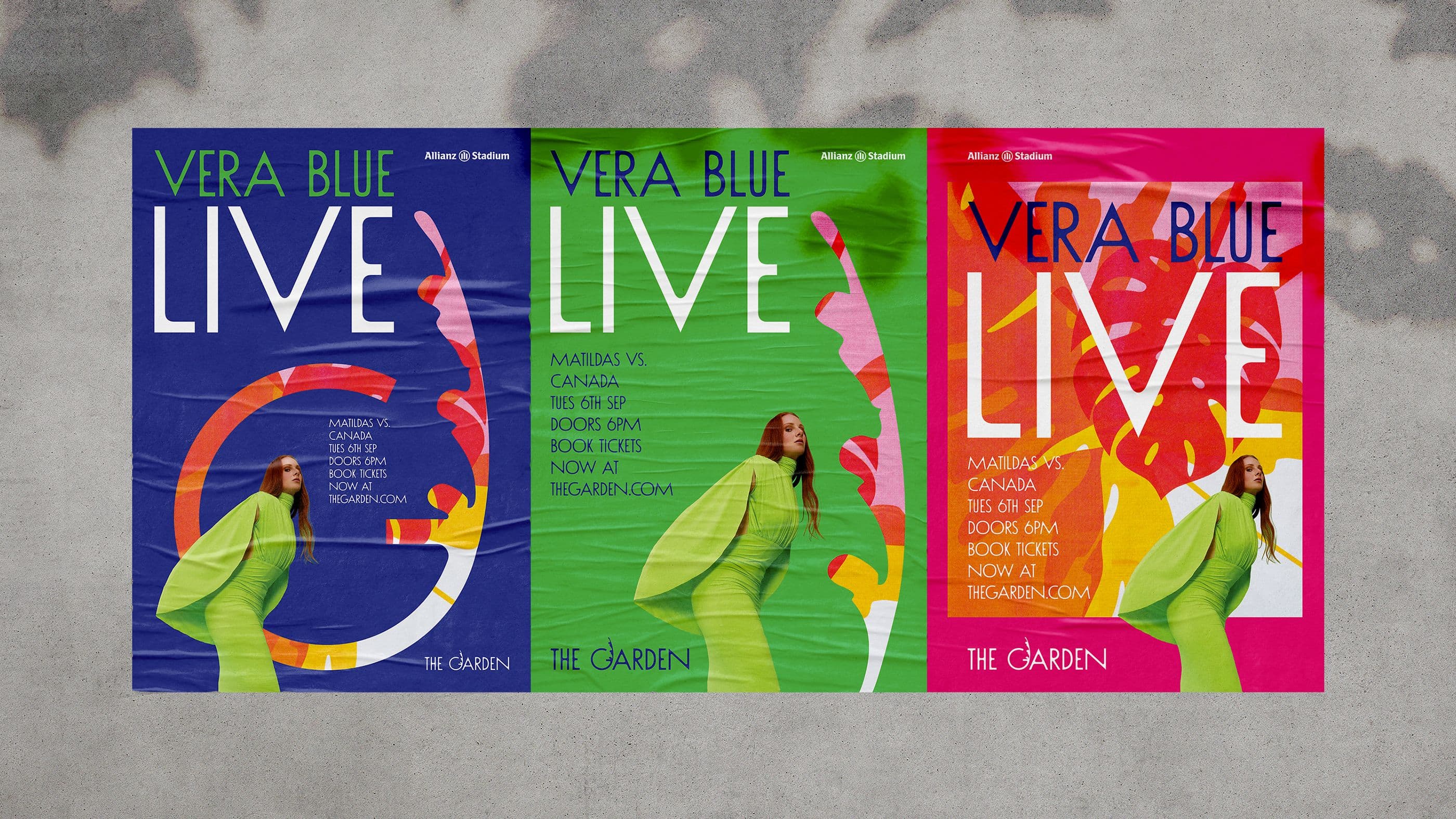
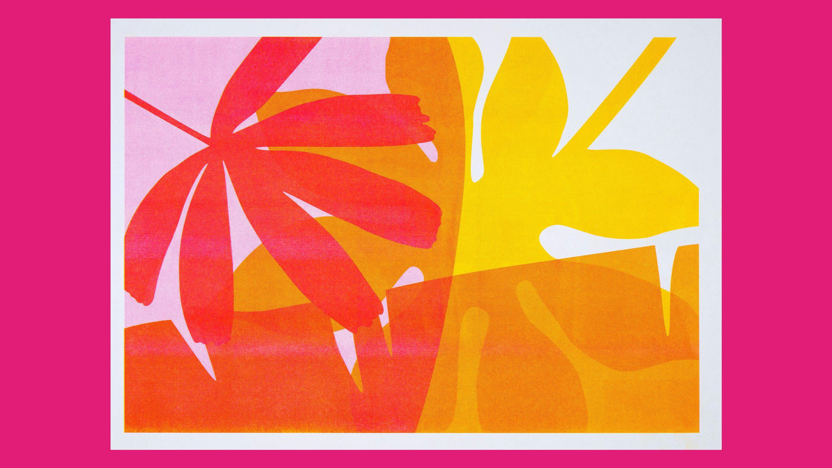
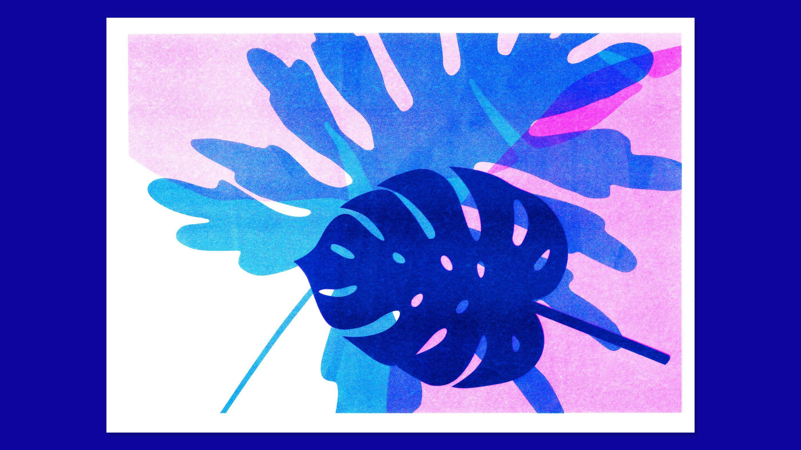
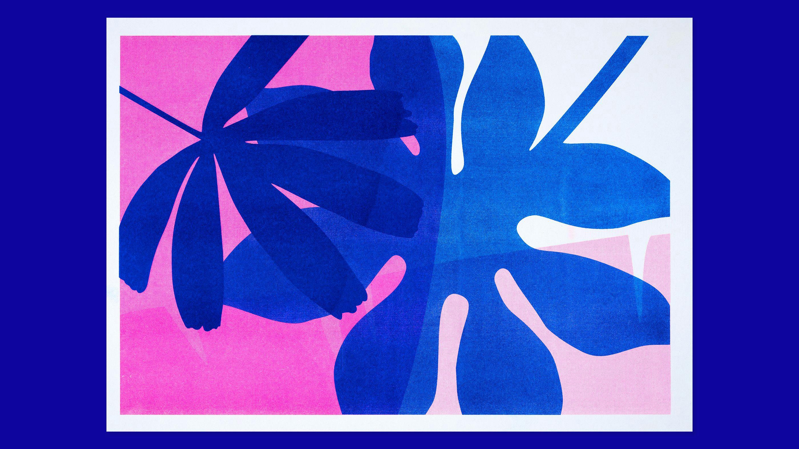
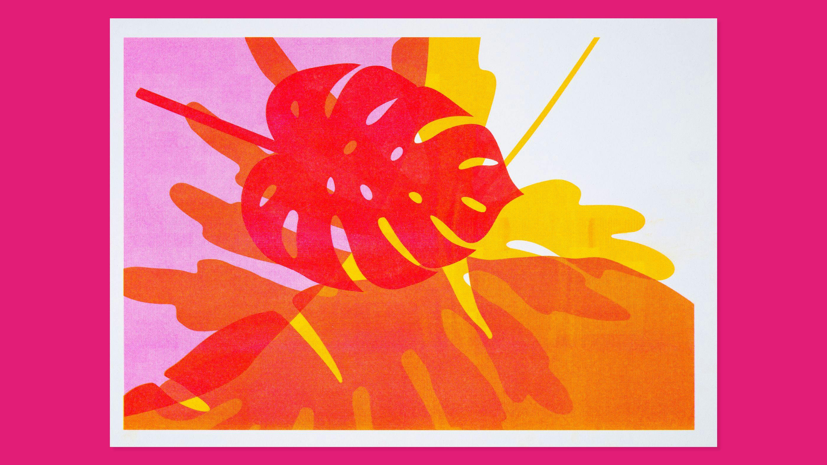
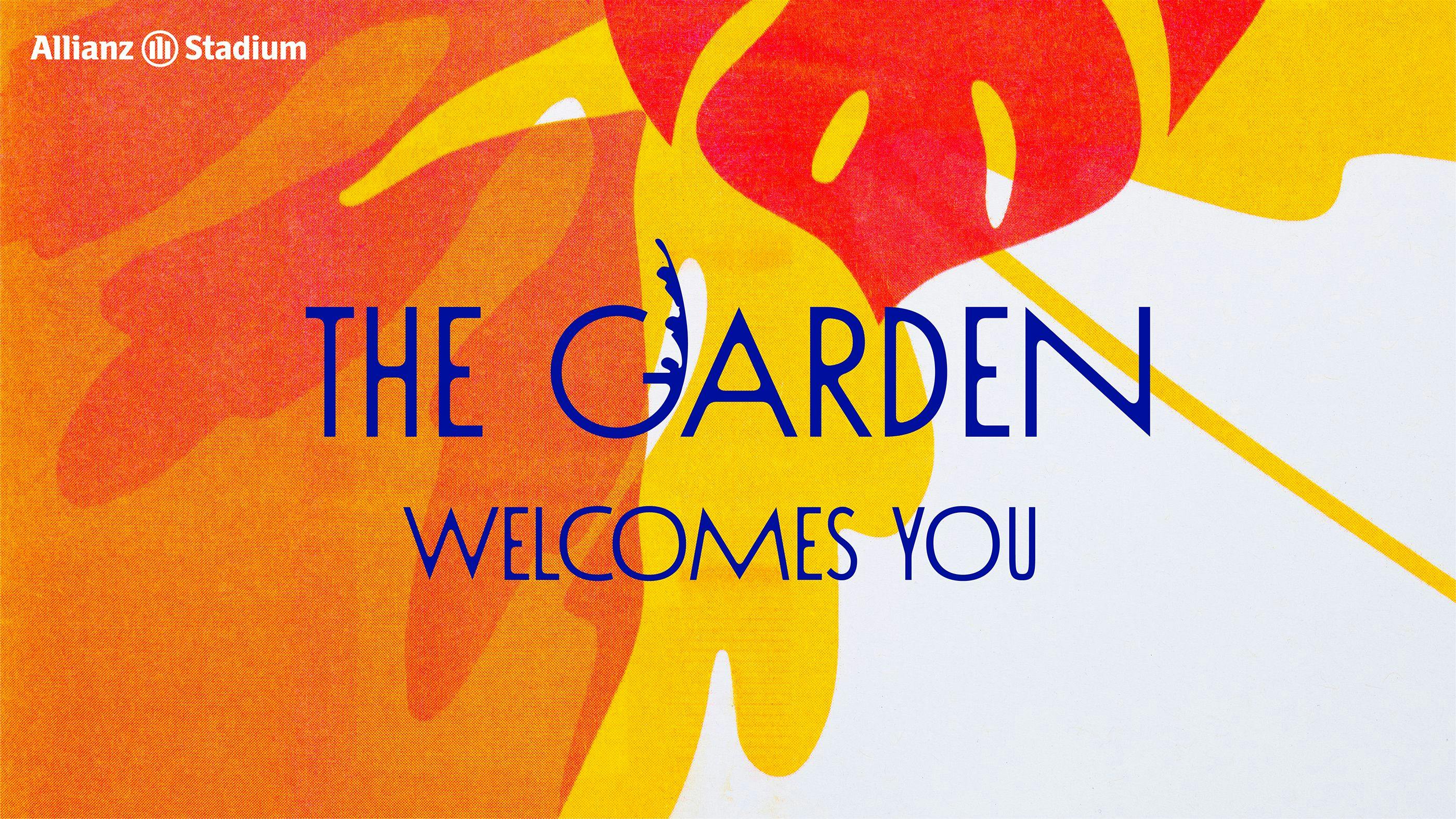
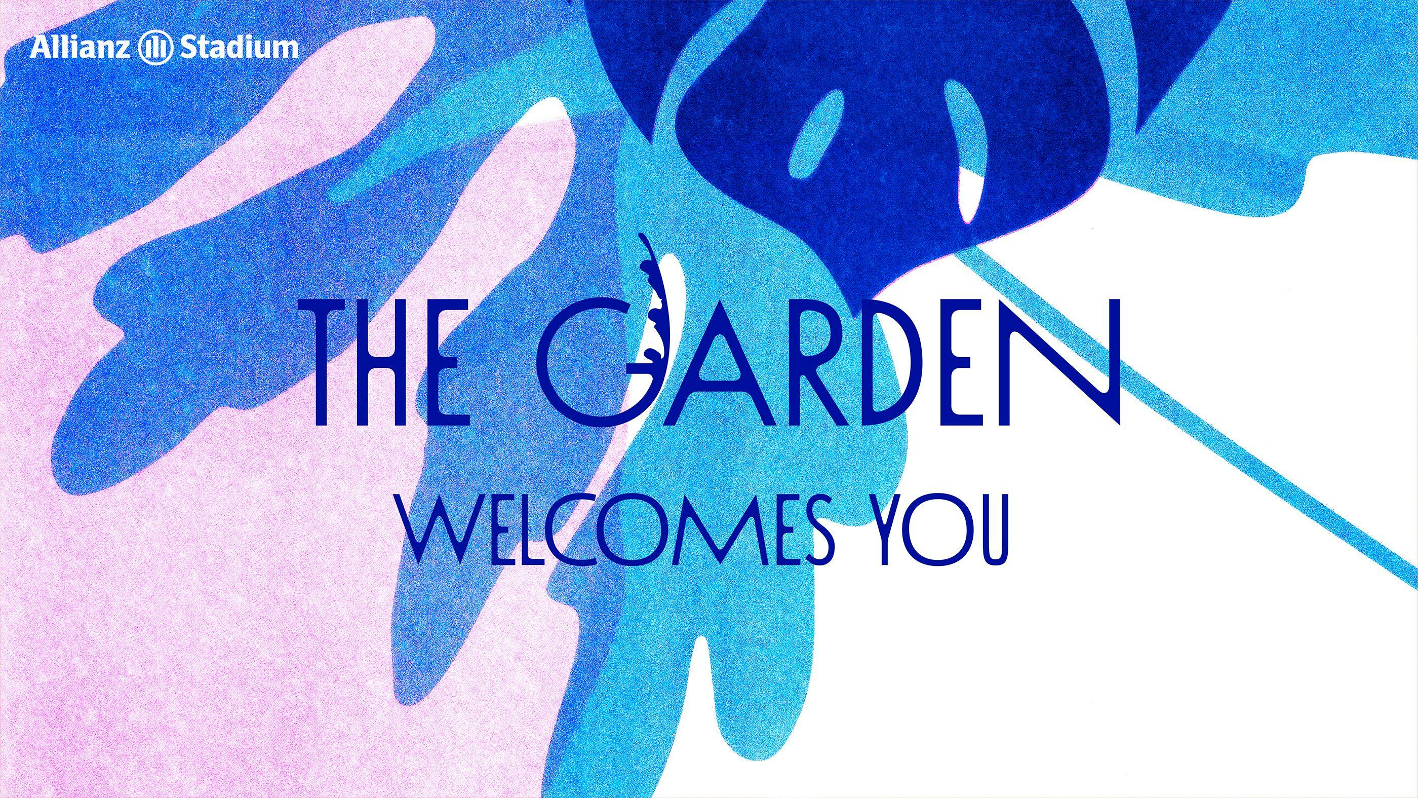
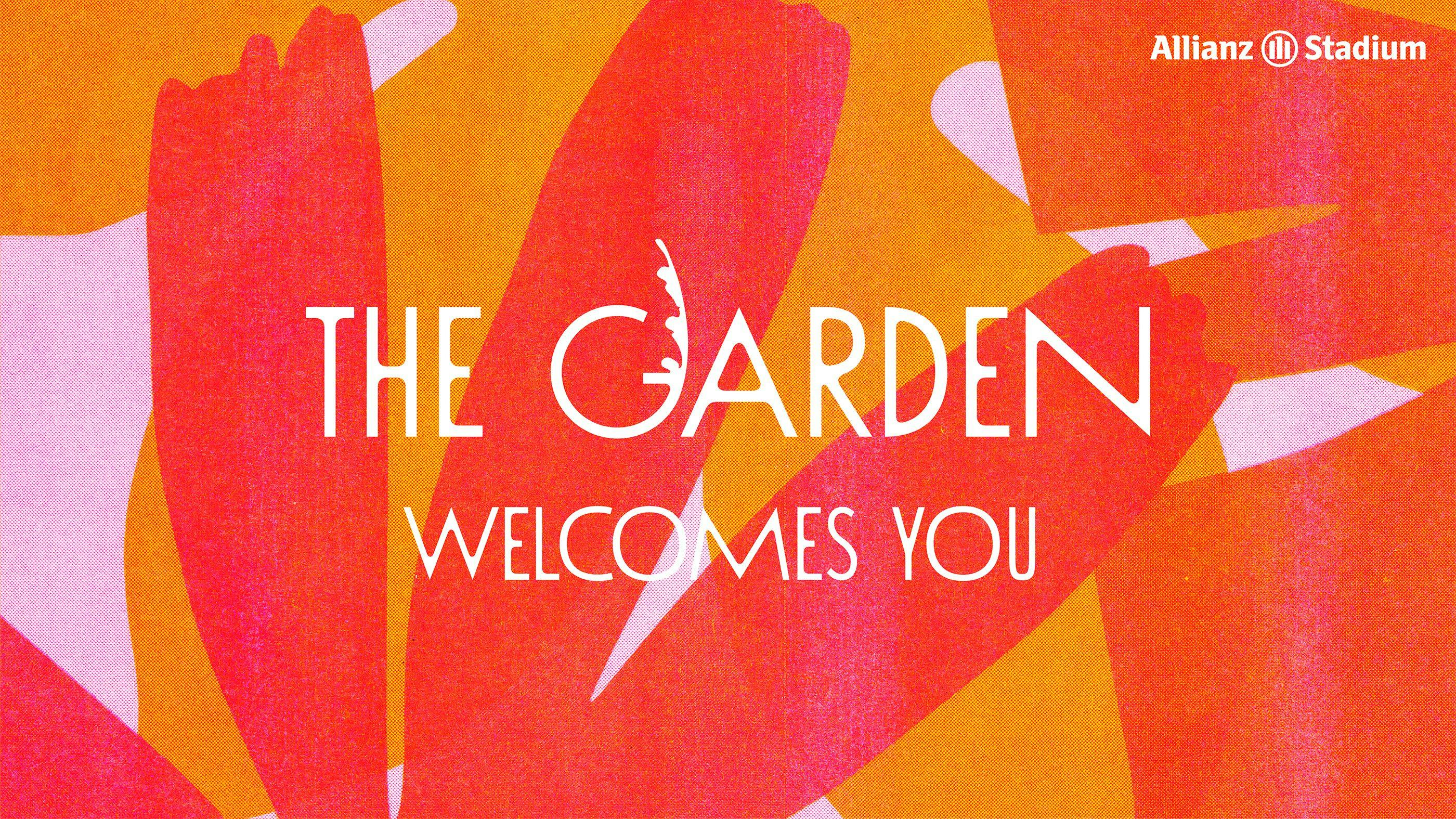
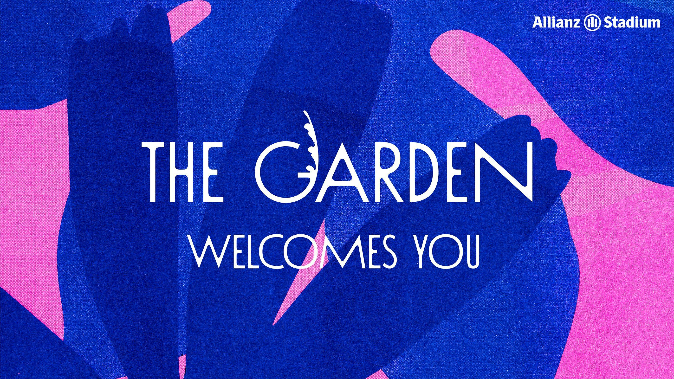
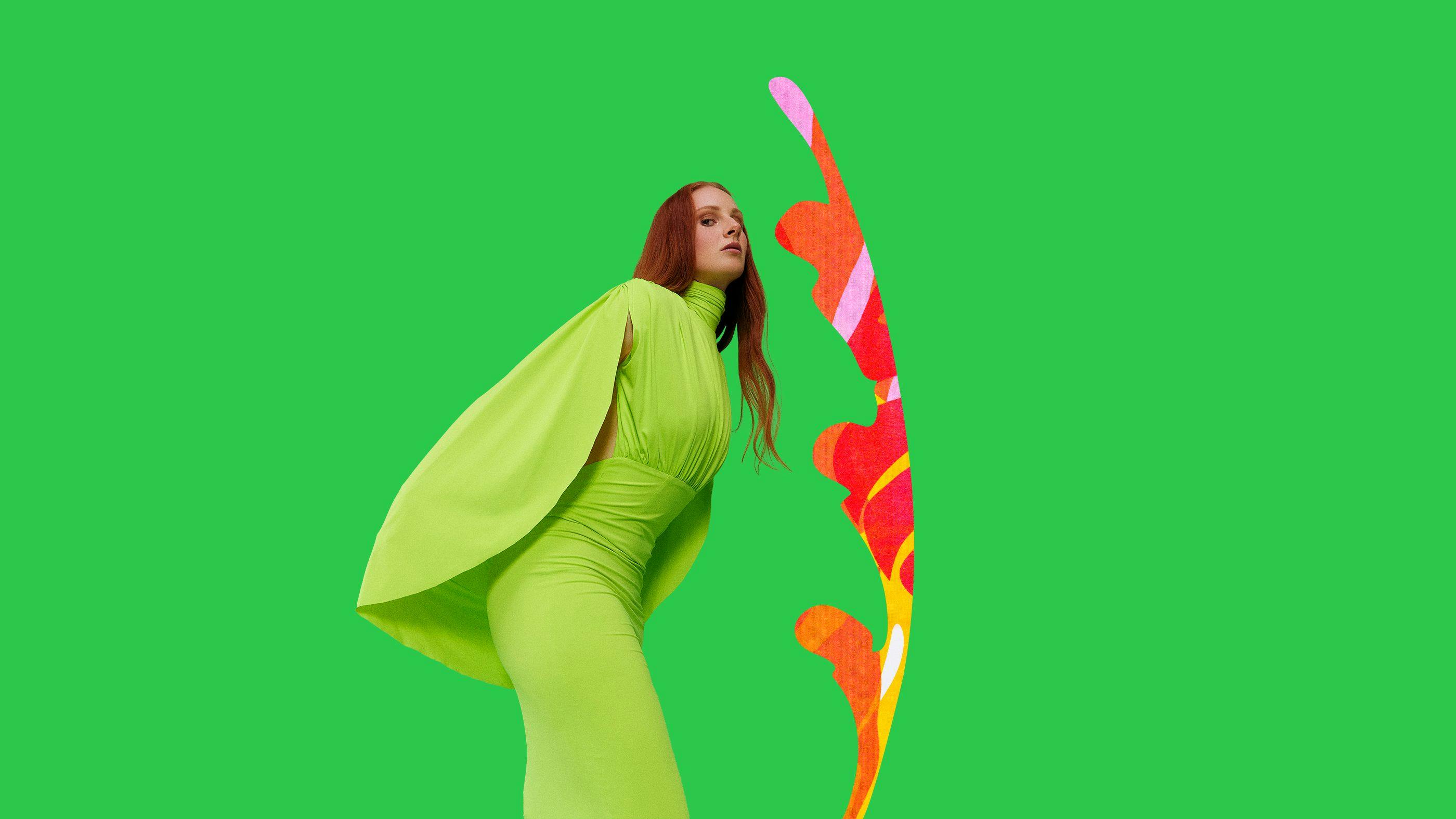
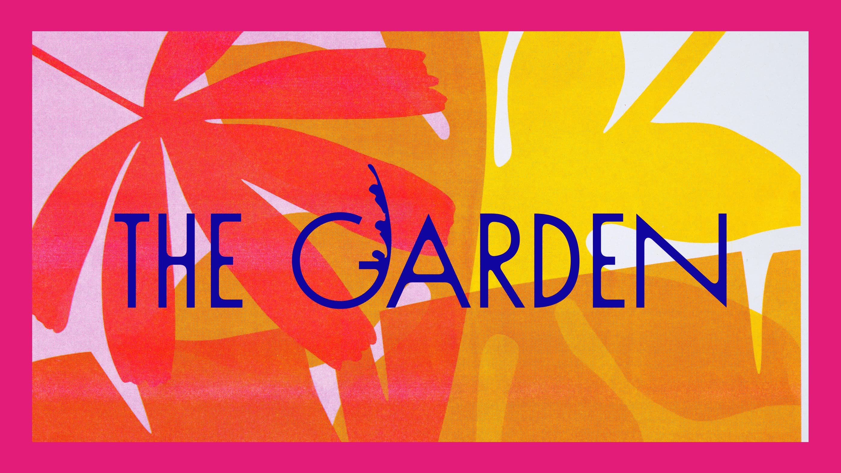
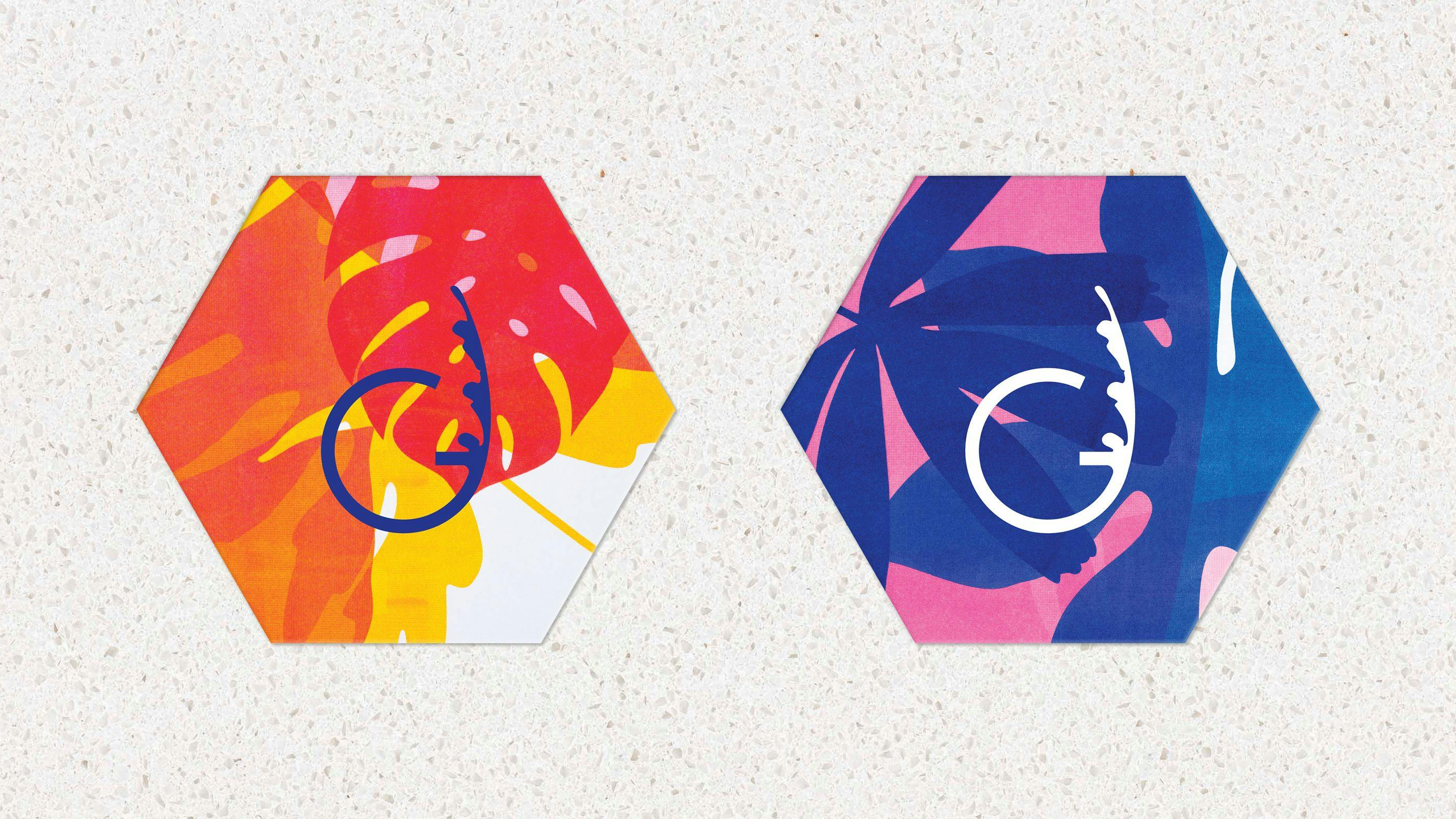
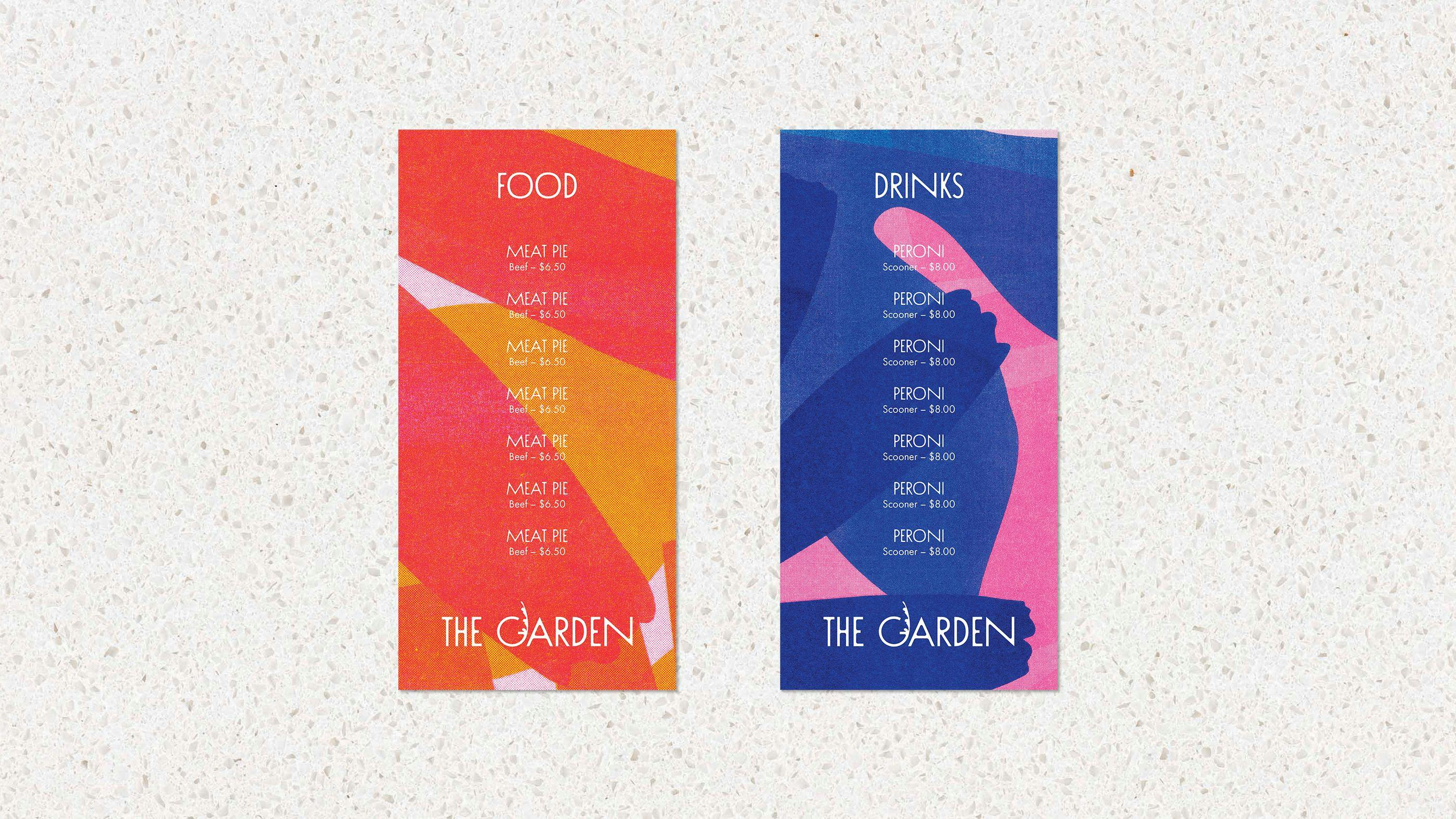
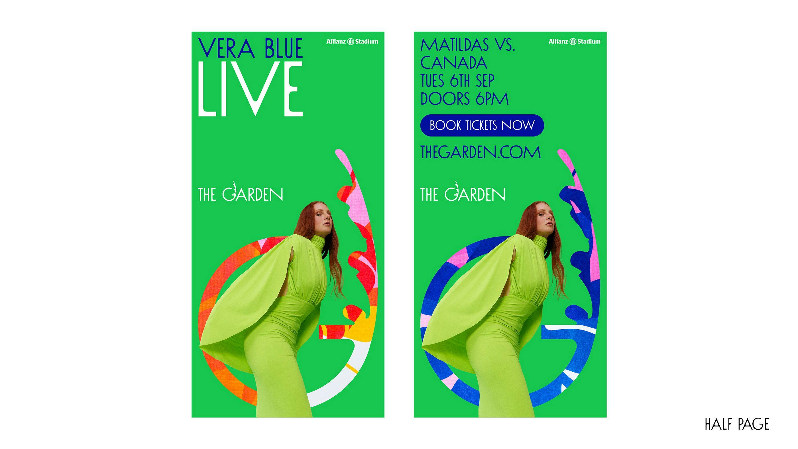
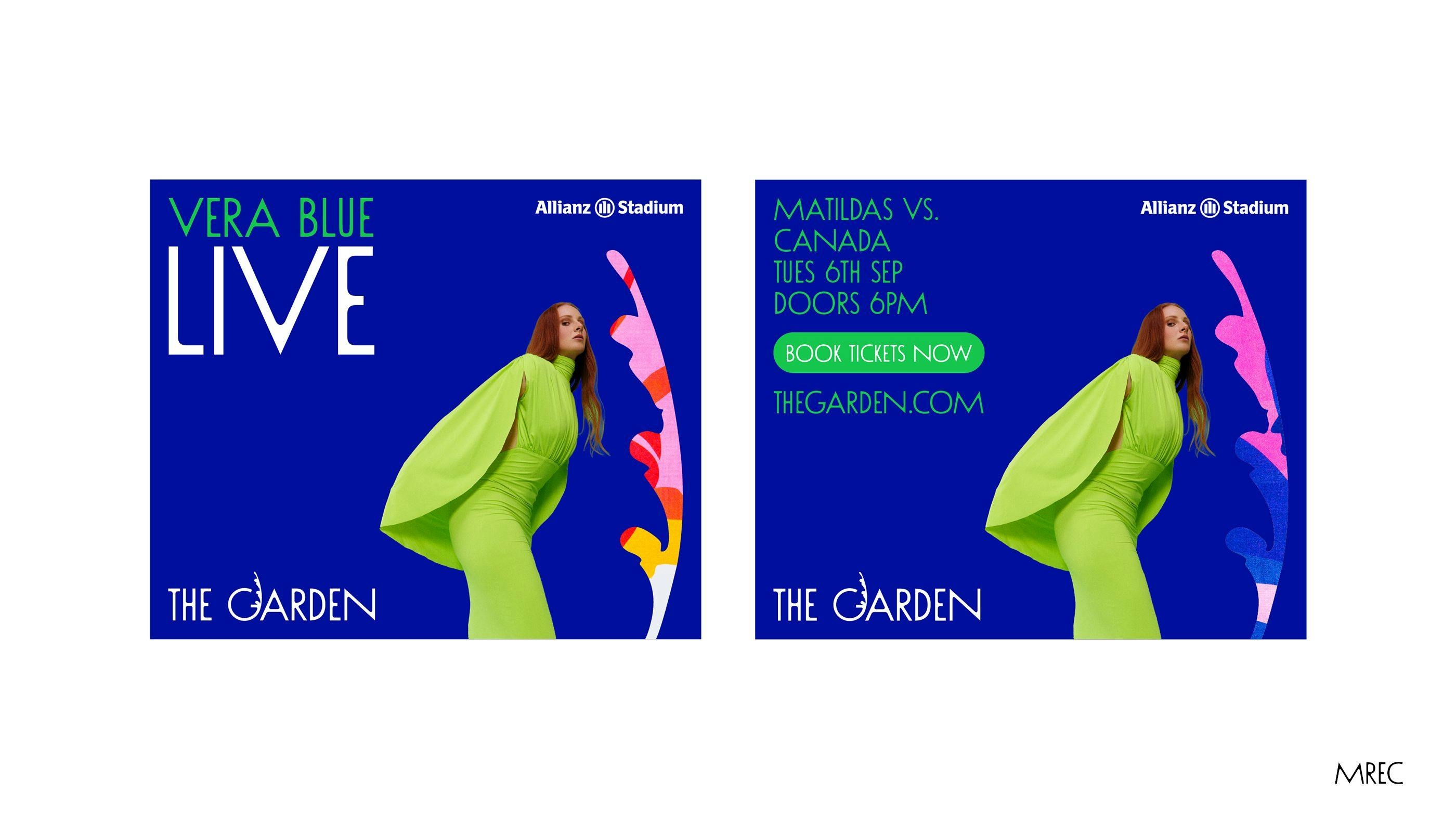
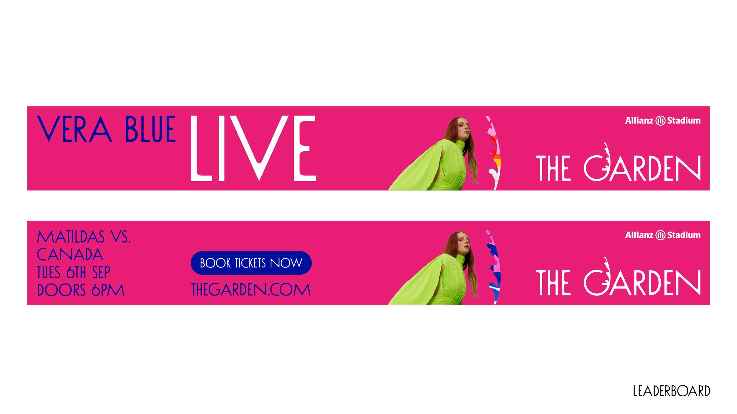
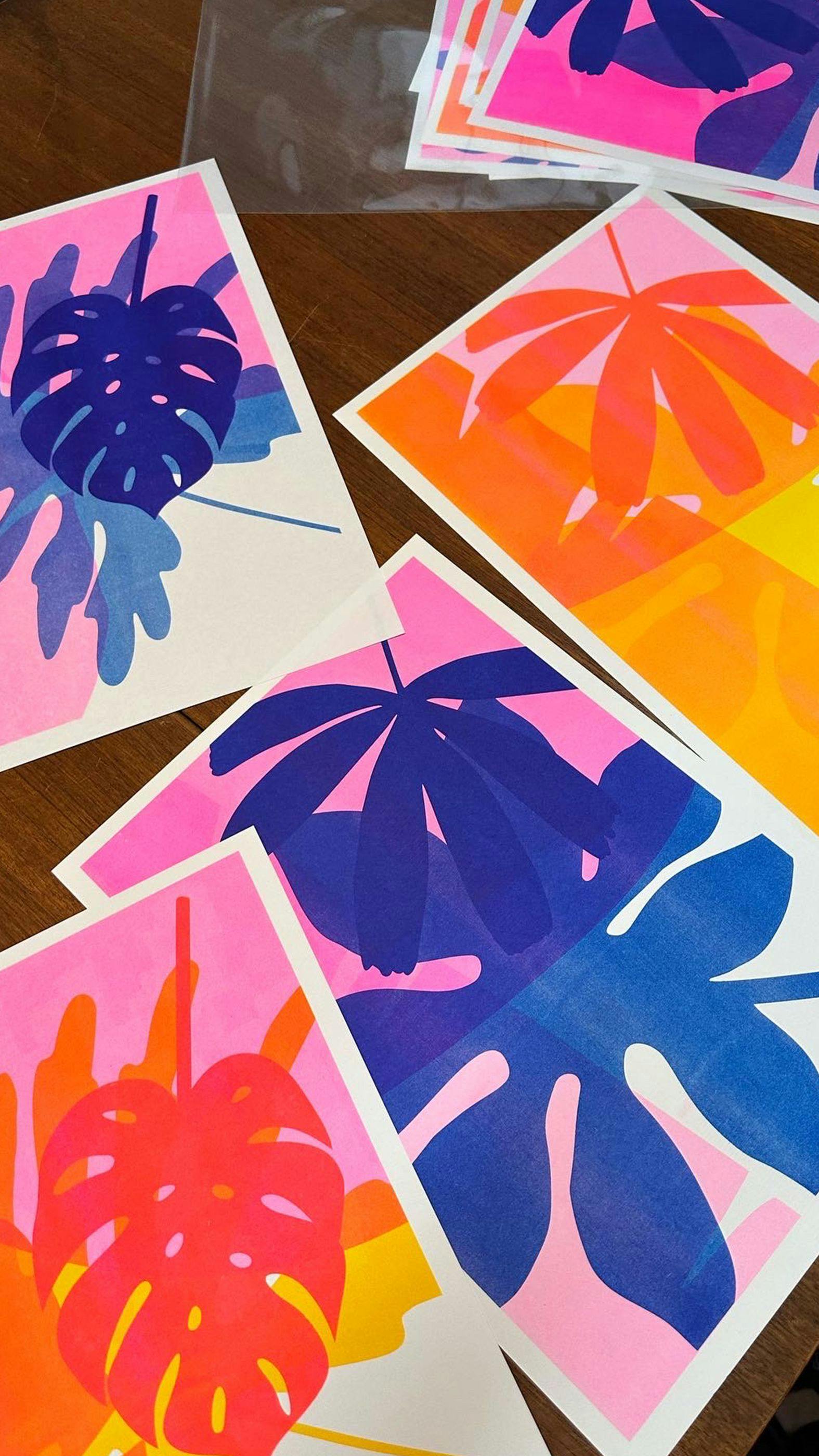
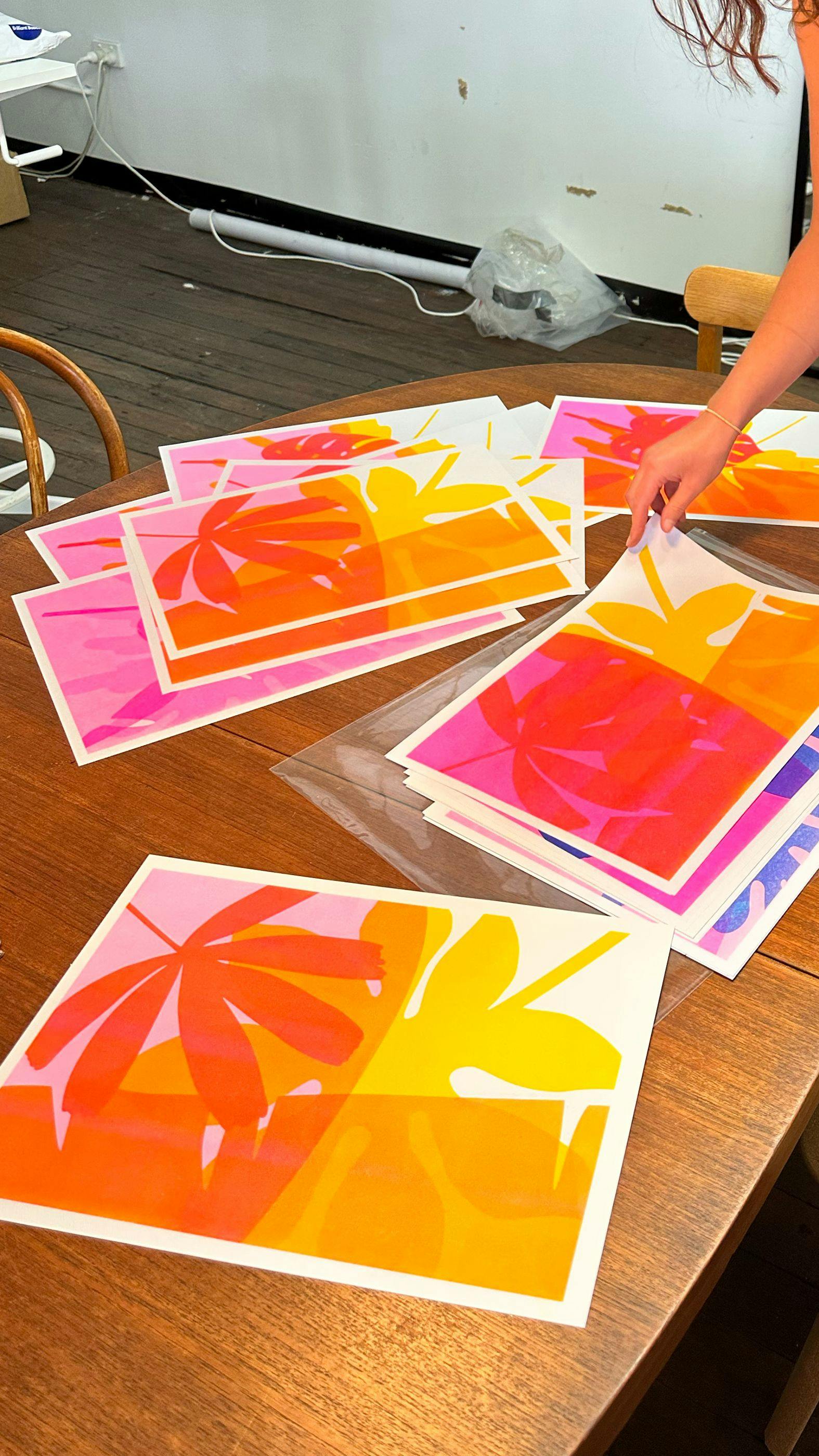
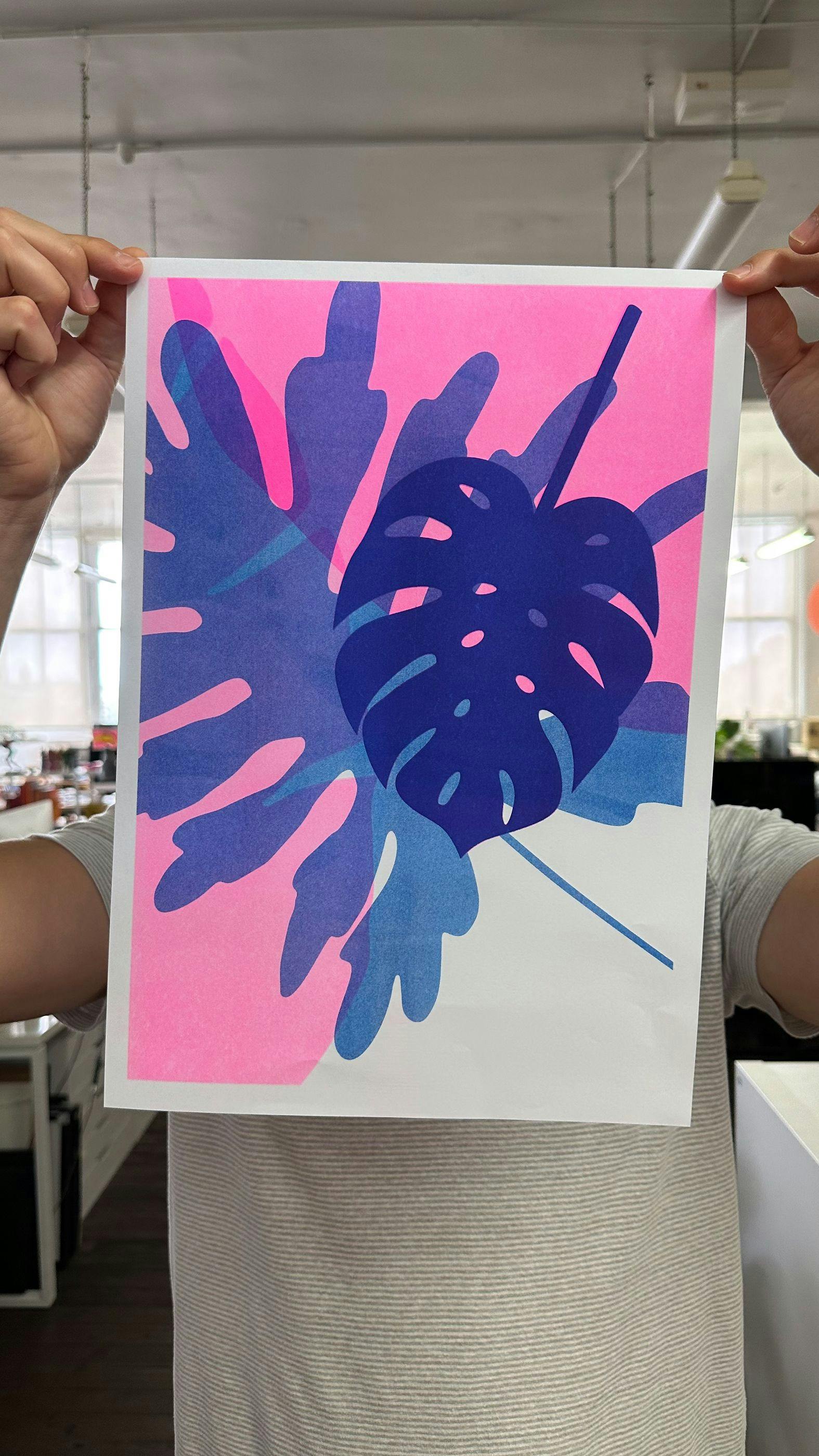
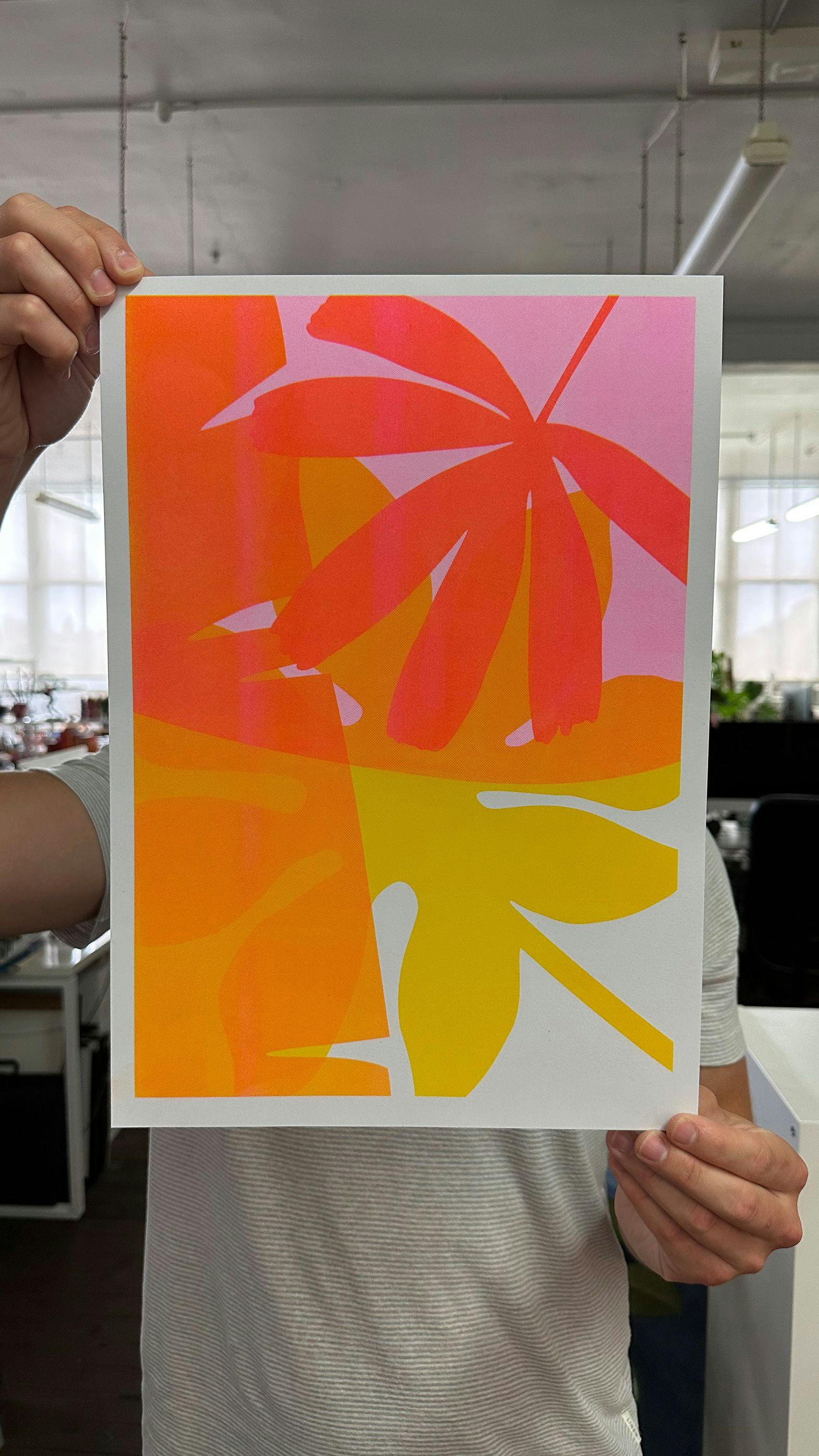
Everything about this brand was inspired by risograph printing, which became the centrepiece for the identity. I wanted to introduce something physical to this project given the nature of the location where the unique crops allow for more creative freedom when designing all the assets. I wanted the illustrations to have a feminine flavour, not ignorant to the sports environment they would display.
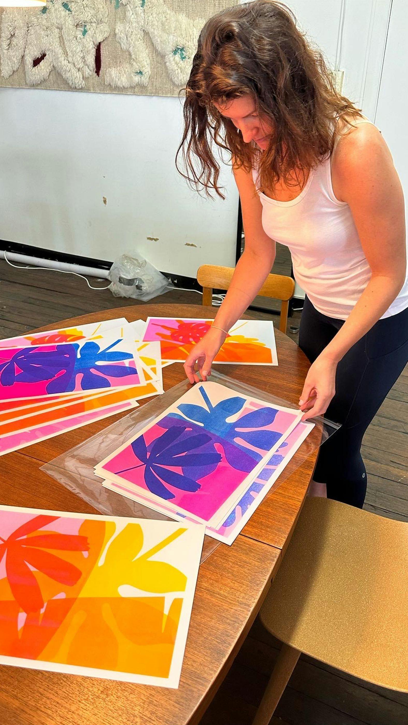
The bright risograph illustration graphics remove everything cliché about a garden. They're bright, bold and blemished all over – all 24 of them!
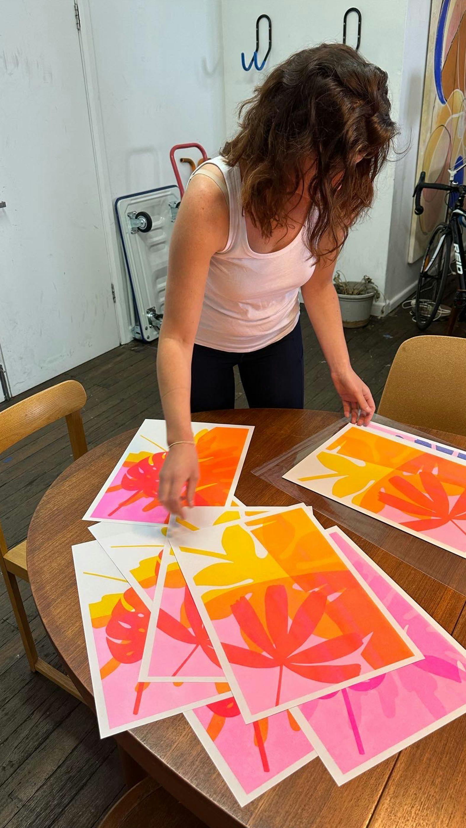
The project is now complete which means I no longer need the physical prints. So I’ve decided to give them away for free.
Get yours here